Pirates Become Latest Pro Sports Team To Drop Ugly Alternate Uniforms
The Pittsburgh Pirates became the latest Major League Baseball team to unveil their "city connect" alternate uniforms.
And they are, well, not great. Just like so many other Nike-derived city connect jerseys.
The Pirates uniform set at least has some connection to historic colors used by the organization. Predominantly in jerseys from the 1970's, Willie Stargell era.
But instead of simply referencing that color scheme, Nike decided to shorten Pittsburgh to "PGH" and add a weird design to the top part of the jersey.
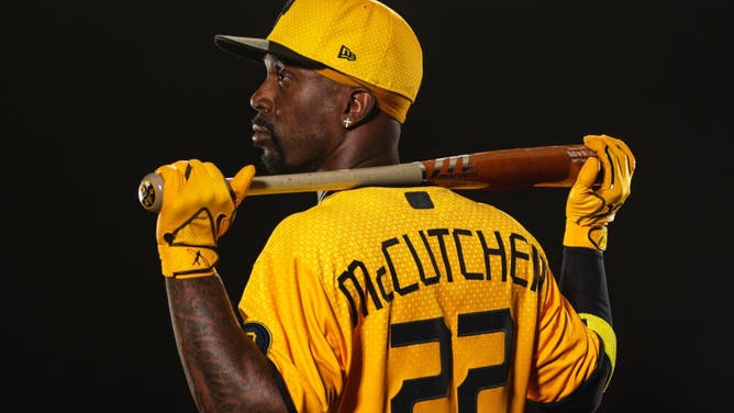
Andrew McCutchen wearing the new City Connect jerseys. (Photo from Twitter/Pittsburgh Pirates)
To be fair to both Nike and the Pittsburgh Pirates, these jerseys are far less hideous than some of their other alternative designs.
The Boston Red Sox have been cursed with a yellow and light blue design that looks especially bad when worn with their traditional hats.
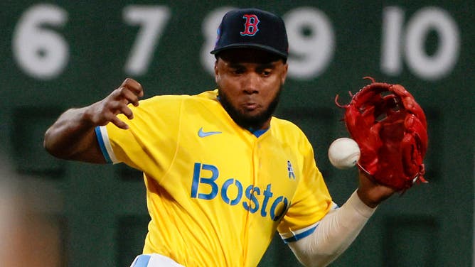
Boston, MA - June 18: Boston Red Sox SS Pablo Reyes takes away a hit in the fifth inning. The Red Sox beat the New York Yankees, 4-1, in Game 2 of a doubleheader. (Photo by Matthew J. Lee/The Boston Globe via Getty Images)
Pirates Alternative Design One Of Many Uniform Mistakes
There's nothing wrong with thinking outside the box, or attempting to reference a connection to the team's region.
But there has to be a better way than what Nike's done over the past several years.
While the city connect series was supposed to be an opportunity to create new, exciting concepts to appeal to younger fans, they're often either too boring or too outlandish.
The Dodgers' alternate jerseys are so despised that the players have taken to wearing white pants instead of the all blue, "smurf" look.

LOS ANGELES, CA - AUGUST 20: Los Angeles Dodgers pitcher Walker Buehler (21) throws a pitch during the MLB game between the New York Mets and the Los Angeles Dodgers on August 20, 2021 at Dodger Stadium in Los Angeles, CA. (Photo by Brian Rothmuller/Icon Sportswire via Getty Images)
Some of the new designs have proven to be popular with fans. San Diego's uniform, while not particularly good looking, has been a massive hit.
READ: NEW CITY CONNECT JERSEYS FOR THE SAN DIEGO PADRES LEAKED AND THEY ARE ATROCIOUS
But the Pirates jerseys are particularly frustrating because they could have been much better.
That said, they could also have been worse. Nike could have used the city's airport code, PIT, instead.
Maybe next time.