Nike's New MLB Jerseys Are Still Unbelievably See-Through
While the first few months of the 2024 Major League Baseball season have seen major injuries, star-level performances, and even a few trades, perhaps its most defining feature has been the game's new uniforms.
Nike, now infamously, redesigned the on-field jerseys heading into 2024, triumphantly rolling out a new template in spring training. Immediately, problems cropped up.
The names on the back of the jerseys were sometimes comically small. Standardization meant that the curvature could result in bizarre visuals for certain players. Players complained, saying the fabric felt cheap and far less premium than past seasons. The gray colors on the away jersey tops and bottoms haven't been even remotely close to matching. Not to mention they often get soaked with sweat, leading to laughable discoloration.
READ: MLB Jerseys Have A Sweat Problem
And of course, there were issues with the jerseys being see-through.
The problems were so obvious, widespread and frustrating that Nike and MLB were forced to issue a joint press release recently acknowledging the mistakes and promising to correct them in the near future.
READ: MLB Officially Announces Sweeping Changes To Unpopular New Jerseys
But those fixes aren't coming soon enough for certain jersey styles. The San Francisco Giants debuted their City Connect jerseys with the new fabrication during Tuesday night's game against the Los Angeles Dodgers, and in certain lighting, it led to a comically see-through uniform.
One photo of Casey Schmitt got a particular amount of attention, and it's not hard to see why. In fact, it's not hard to see anything.
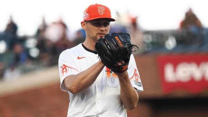
San Francisco - San Francisco Giants starting pitcher Keaton Winn before a pitch against the Los Angeles Dodgers during the second inning at Oracle Park on May 14. Photo: Kelley L Cox-USA TODAY Sports
Giants Uniforms Show How Much Work Nike Has To Do
In other lighting conditions, the see-through look wasn't quite as obvious. But the fact that it looks like that in any lighting is ridiculous. And it never should have happened.
Nike didn't need to reinvent the wheel with the MLB jerseys. Sure, make the lettering marginally smaller, change the placket and fabrication. Heck, some of its work on standardizing colors has led to a better, more cohesive matching set between hats and accessories.
But this kind of look is inexcusable and makes the jerseys look cheap. And how does the league and Nike expect to increase merchandise sales when the uniforms look this bad?
Those fixes can't come soon enough. Too late for Casey Schmitt.