Nike Can’t Stop Ruining MLB Uniforms
When Nike took over the contract to produce the uniforms for Major League Baseball, they should have had a very simple goal: don't mess it up.
No one, fans or players, complained about the previous version. Sure, there were some small changes around the margins that could be improved; better color matching for example, or enhanced materials that would look and perform better. Instead, every change they made has been almost universally decried as an abject failure.
The new fabrication, instead of improving performance, gets soaked through with sweat, even in moderate temperatures.
READ: MLB Jerseys Have A Sweat Problem
Because Nike cut corners to save money, instead of developing new pants with the same fabrication as the jersey tops, they just reproduced the old pants with different fabric. Meaning that the gray colors don't come close to matching. Another embarrassment.
Players complained about the lack of tailoring and customization options, especially for the pants. And then there's the City Connect uniform set.
While some, specifically those for the Los Angeles Angels, have been well received, most have been widely derided. On Monday, Nike released the second set of the City Connect jerseys for the Los Angeles Dodgers, replacing another much hated jersey design. The first set featured all blue jerseys, with white socks, and a very creative "Los Dodgers" script on the front and caps.
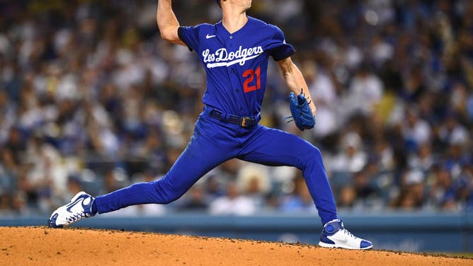
LOS ANGELES, CA - AUGUST 20: Los Angeles Dodgers pitcher Walker Buehler (21) throws a pitch during the MLB game between the New York Mets and the Los Angeles Dodgers on August 20, 2021 at Dodger Stadium in Los Angeles, CA. (Photo by Brian Rothmuller/Icon Sportswire via Getty Images)
It was, unsurprisingly, not popular.
So Nike redesigned the City Connect jerseys for the 2024 season, intending to connect them more to the city of Los Angeles and Dodger Stadium's unique design.
They didn't.
The team's press release claimed that the little pop tart-style colored dots are supposed to represent the "galaxy of stars" that's in Los Angeles, as well the color scheme of the Dodger Stadium seating bowl. The "Los Angeles" wordmark on the front of the jersey also was supposed to mimic the font of the LA Coliseum with an "upward trajectory" to represent the city's pursuit of the beyond.
Instead, it looks like they just copied the DirecTV logo.
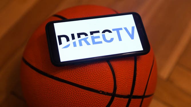
DirecTV logo.(Photo by Jakub Porzycki/NurPhoto via Getty Images)
Nike Can't Get MLB Jerseys Right
Even fan concept jerseys have shown more creativity and cohesive design than Nike's offerings.
One rendering actually incorporated the Dodger Stadium color scheme, while retaining the classic word mark that's immediately associated with the Dodgers organization.
The light blue, orange, yellow and darker blue are all part of the Dodger Stadium color scheme. Even if Nike wanted to use the late-1950's or early-1960's font style that's prevalent throughout the stadium, it'd have been a more successful design.
Instead, they have some numbers on the back of the jerseys that cut off into the player names, which are underneath the numbers for some marketing-speak reason, and some that don't. Will Smith's #16 is cut off at the bottom, but Shohei Ohtani's #17 isn't. And they added a "0" in front of single digit numbers, which looks objectively terrible.
This isn't that hard. Yet Nike still manages to screw it up. Rinse, repeat.