Mississippi State's Primary School Logo Is Off-Center And Now It Is Impossible To Unsee
Mississippi State's primary university logo is off-center. No, seriously.
The main logo that is used in connection to Mississippi State University is completely out of line. You will never be able to unsee the clear spacing issue.
When you go to the school's official website, www.msstate.edu, the logo is featured right up top. It is one of the first things on the page.

The official Mississippi State website.
The logo is also featured throughout campus, on any school-issued literature, and on a lot of school-issued merchandise. It is even displayed prominently outside of Davis Wade Stadium, the university's football stadium.

Davis Wade Stadium. (Image courtesy: Mississippi State)
However, it is aesthetically unpleasing. The logo was created with a conscious graphic design decision that leads it to look strange.
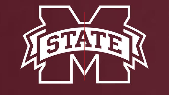
Mississippi State's official university logo is off-center.
When you look carefully at the logo, the 'A' in State is not lined up in the middle— which would be where the background 'M' reaches its middle peak. Instead, it is slightly off to the left.

Mississippi State's logo is off-center.
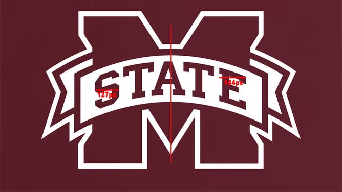
The reason does not appear to be because someone messed up the placement of 'STATE.' Instead, it appears to stem from the 'S' and 'E' being different widths. When you look at the logo in an editing platform like Adobe Photoshop, it is quickly discovered that the 'S' is about 127 pixels wide, while the 'E' is about 144 pixels wide— give or take a pixel or two.
The graphic designer, ultimately, chose to anchor the center to the five letters of 'STATE' rather than to the center letter 'A.'

Mississippi State's logo is disproportionate.
According to the MSU website, the university first developed a "comprehensive visual identity program" in 1992. That included the first-ever wordmark and specifications for how graphic symbols, including the university seal, should be used.
In 2008, the trademarks and licensing committee worked alongside University Relations and a campus committee did something of an overhaul. They set out to:
Going off this timeline, it would seem as though the university had two opportunities to get it right. At the very least, the 2008 revisiting of the logos provided an opportunity to fix the anomaly if it was first made in 1992.
But it wasn't changed. Mississippi State's official university logo remains off-center to this day.
You will never be able to unsee it.