Mets, Nets Torture NYC Sports Fans On Same Day With Horrible Jersey Decisions
It's not easy being a New York City sports fan these days.
The city hasn't won a professional sports championship since all the way back in 2011. That's the second longest championship-drought for a city that boasts teams like the Yankees, Mets, Giants, Jets, Knicks, Nets, Rangers, and Islanders.
Not great for a place that prides itself as "the greatest city in the world."
But yet the Nets and Mets feel like the fans haven't suffered enough. Now, they want their fanbase, as well as their players, to walk around looking like clowns as well.
METS, NETS ARE GETTING RIDICULED FOR THEIR JERSEYS
The Brooklyn Nets have unveiled their new "City Edition" jerseys that they'll be sporting next year on the court and I'm sorry but you have GOT to be kidding me with this.
With giant block-like letters, the 'Nets' word comes across as something that someone made back in the Windows 95 Microsoft Paint days. I know the new Super Mario Bros. movie is currently in theaters, but I didn't think the Nets had to make a jersey in the same style!
The City Edition jerseys are supposed to be "cutting edge" and "hip" but as the kids say these days - this aint it.
I think the Nets were trying to go for a street graffiti kind of look. Ya know, because New York City has fallen so bad that the city looks like it's the 1980's again with all the crime that's going on. But also - there is some pretty cool graffiti font and styles out there. You could have done SO much - cursive lettering, maybe a neon-type vibe, but instead they went with blocks for a blockhead of a franchise.
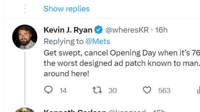
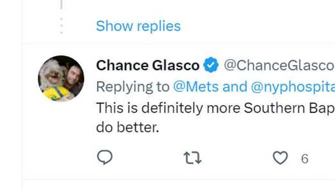
As you can imagine, fans were not too pleased with the new look.


BUT WAIT JUST A MINUTE...
However, it's not just the Nets that wanted to depress their fanbase, but also the Mets.
Yes, it appears that billionaire owner Steve Cohen is trying to recoup some money after having the league's highest payroll at over $360+ million this season through some advertising revenue.
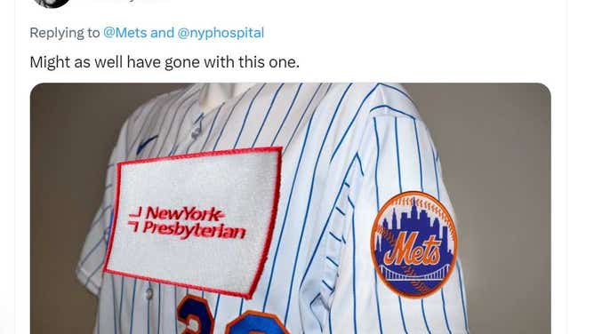
The Mets announced that they have partnered with New York-Presbyterian Hospital by adding a new patch on their jerseys. The only issue is that the logo is GIGANTIC.
Woof.
Wearing these brings new heights to a 'walk of shame,' that's typically felt after a college night bender.
Listen, I'm all about supporting our hospitals, and shout out to New York-Presbyterian Hospital and all the hard workers over there that are a lot smarter and tougher than I am. But is THIS really the best way to honor and partner up with them? You'd feel like naming the scoreboard after them or maybe having a food or drink option dedicated to them would suffice.
Not this giant NASCAR-like pizza box of a patch on the sleeve. Looks like they put baseball's newly enlarged bases on it.
The jersey moves are the latest changes for a city that continues to lose its sports identity.
We recently had Aaron Judge signing fake Yankees jerseys. And let's not forget when the Empire State Building went green to celebrate the Philadelphia Eagles advancing to the Super Bowl. Nothing like cheering on our divisional rivals!
The Mets will unveil their jerseys later today during their home opener when they host the Miami Marlins. I'm sure the fans will erupt in cheers.


UPDATE: Mets owner Steve Cohen has since said that the team will change the jersey patch logo - which has "Phillie colors." He said that the new revised logo will be more "Met-appropriate."