Carolina Panthers Send NFL Fans Into A Frenzy By Breaking Out Old School End Zone Font And Midfield Logo
The Panthers turned back the clock this weekend and it was awesome. As Carolina hosted Arizona on Sunday, the organization decided to switch up its look.
To do so, the Panthers broke out a throwback end zone font and put the team's old logo at midfield. Carolina changed its logo in 2012 to a more modern look.
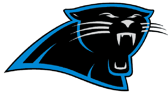
Here is the team logo from 1995 to 2011:

Carolina Panthers old logo.
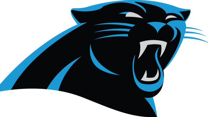
Here is the team logo today:

Carolina Panthers current logo.
While there is not too much of a difference, there are a lot of Panthers fans who wish that they logo would have just stayed the same. They were ecstatic when the team rolled out its throwback logo and end zone font on Sunday.
Fox NFL's Will Kunkel was at Bank of America Stadium early and was the first to reveal the new — well, old – look.
In response to the news about the Carolina Panthers' old school end zone and logo, NFL fans were beside themselves.
They were thrilled. Especially those in North Carolina. Absolutely nobody was disappointed by the decision to go back in time by a decade.
It has yet to be seen whether the throwback logo and end zone wordmarks will help bring the Panthers any success. However, the team had four 10+ win seasons when they were in use, and have had just three since.
Could the logo make all of the difference? If Baker Mayfield and Carolina pull off a win over Arizona on Sunday, the team should never go back to the present day.