Canadian Army Unveils New Branding And No One Can Tell What It Is; Is It The Worst Logo Redesign Ever?
It's weird to think of military branches unveiling new branding the same way a team does, but the Canadian Army just did, and people from St. John, Newfoundland to White Horse, Yukon and beyond have no clue what the hell it's supposed to be.
The Army dropped the new look in a slick video on its social media channels.
…what?!
You can see the Canadian Army seal in that video too and it's about as classy as you can get. Fortunately, after everyone saw that new little logo, they made sure the public knew that the original logo was staying in use.
Good to hear, because what even is that new one? I see an enemy from the original Super Mario Bros., the state of Florida, or an 8-bit moose.
If that last one is correct — and some are saying it is — it's at least somewhat Canadian.
The maple leaf is weird too. It's like at the last second some executive said they needed to "Canadian-ify it by 10 percent" and they just randomly placed a leaf.
Of course, the Army made the biggest mistake in the book when trotting out a new logo by asking people to leave their comments.
And leave their comments they did. There were definitely some recurring themes too…
That last one was pretty close to my guess — something between a video game character and an animal with antlers so I think I may have been on to something.
Where Does The Canadian Army Compare To Some Of Sports' Logo Redesigns?
There have been some horrendous rebrands in the annals of sports history, so how do they stack up against this abysmal effort from the Canadian Army?
I don't know, let's see…
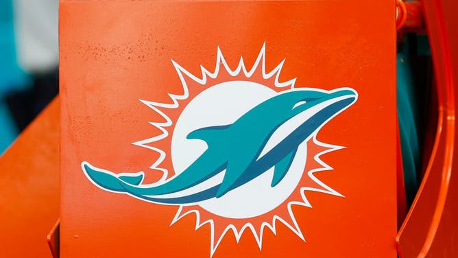
Hey, Dolphins: just give the people what they want and bring back the old logo. (Photo by Brandon Sloter/Image Of Sport/Getty Images)
Miami Dolphins
We all know that the classic Dolphins logo is better than this abstract modernized logo. I think we'll see another trend here as most rebrands fail by trying to be too modern.
It happened to the Dolphins, and it appears to have happened to the Canadian Army,
But whose rebrand is worse?
Well, I can still tell that it's supposed to be a dolphin, so it looks like we've got to hand the win (loss?) to the Canadian Army.
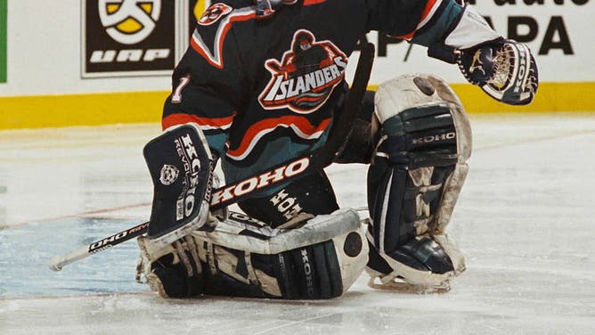
The Islanders won four straight Cups with an iconic logo, so why not change it to something that looks like it's to get people hankering for fish sticks? (Photo by Denis Brodeur/NHLI via Getty Images)
New York Islanders Fisherman
The New York Islanders have an instantly recognizable logo, but for some reason in the ‘90s with everyone’s favorite Boston Bruin who once beat a fan with a shoe, Mike Milbury at the helm as coach and GM they swapped it with the infamous "fish sticks" logo.
Oh, and they added teal for no reason other than it was the mid-'90s and you had to use teal.
It's not a good look, but it does get people waxing nostalgic these days, and it returned over the last couple of years as the Isles' reverse retro jersey.
So is it good? No.
Is it worse than the new Canadian Army logo? Also no.
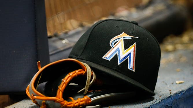
The Marlins dropped "Florida" from their name in 2012 and added "Miami" and a crappy new logo. (Photo by Dylan Buell/Getty Images)
Miami Marlins
The Florida Marlins decided in the early 2010s that they were done being the Florida Marlins and answered alliteration's siren call to become the Miami Marlins.
They introduced a new logo that dropped the old shade of teal from the original — because, remember, it was the '90s when they joined the league — and gave us a lame "M" with some orange and the outline of a marlin.
Boo.
But is it worse than the new Canadian Army logo?
Hmm… this is a tough one.
On one hand, the Miami Marlins logo was so terrible they already changed it again, but the Canadian Army logo looks like ET from that Atari ET game that sold so poorly that they buried the cartridges in the desert.
So, once again, I think we have to give this to the Canadian Army. Its new logo is just so, so awful.