The Top 5 Worst Sports Jerseys
The Internet didn't take too kindly to Nike releasing the new U.S. Men's Soccer kits for the upcoming Qatar World Cup.
And I get it.
There's a powerful dynamic when it comes to a uniform. It doesn't just represent the current players - but also the history and the legends that donned it before. It's an identity; a way of life.
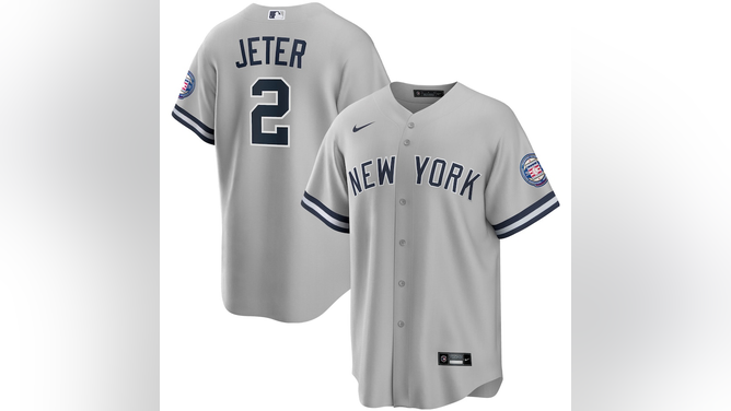
For some fanbases, the jersey is the Holy Grail and you better not mess with it. Any time there's rumblings about the New York Yankees adding names to the back of their jersey, it always ends in a damn near riot by Yankees fans.
And if you ARE a fan who bought the fake Yankee jersey with the name on the back, you are immediately called out for being a fraud.

MLBShop.com
FASHION TRENDS COME AND GO
For other fans, the simple look of a jersey will bring back horrible, dark times of an organization that they'd rather forget.
Choosing the Top 5 Ugliest Jerseys was especially difficult because of how fashion has changed over time. Something that looked hideous a few decades ago now doesn't seem so bad. At first I hated those Tampa Bay Buccaneers creamsicle uniforms. But now? They aren't THAT bad, although their team was a disaster on the field while wearing Bucco Bruce.
The sports apparel market is absolutely booming right now - expected to reach nearly $250 billion in revenue by 2026.
With this will come leagues and teams continuing to oversaturate the market with alternate, throwback, Anniversary, random jerseys for no real reason except to make more money from them. Just wait until more jerseys have sponsored logos on them. Yikes.
But let's not look to the future - but instead to the past, and have a good laugh at some of these uniform gems:

October 9, 2016: Pittsburgh Steelers quarterback Ben Roethlisberger (7) warms up. (Photo by Shelley Lipton/Icon Sportswire via Getty Images)
5. PITTSBURGH STEELERS 2012-2016 BUMBLEBEE JERSEYS
One word: Jail.
I look at these uniforms and immediately think I'm looking at a group of players all lined up - numbered and ready to be put in prison. The Steelers wore these bumblebee schemes to give a modern take to their inaugural 1933 jerseys. The fact that they wore these for multiple years is just stunning. And that giant number in the middle looks like someone drew it with a magic marker and stuck it on a piece of tape.
4. PHILADELPHIA EAGLES 2007 YELLOW AND SATIN BLUE
It's always a bad idea when someone turns on the game and for the life of them can't figure out what team is playing because of their jersey.
There's plenty of examples of this throughout all the sports leagues. This throwback nod by the Philadelphia Eagles during the team's 75th Anniversary takes the cake though. These things look like someone cut up the Swedish flag and made uniforms out of them. The Eagles have so many different green options, and they went with this? Poor Donovan McNabb.
3. SEATTLE MARINERS 1998-1999
The Mariners wore these as part of Major League Baseball's "Turn Ahead The Clock" promotion in 1999.
Clearly whoever designed these was so worried about the looming Y2K threat at the time, that they decided that everyone must re-learn how to use a compass. So here's the sleeveless jersey - with a giant ass compass on it. Even Ken Griffey Jr. - so smooth and so cool, couldn't make this jersey work.
2. PITTSBURGH PIRATES 1999
This jersey was supposed to be the future for the Pirates. And just like their annual playoff dreams, it ended quickly. I can only assume whoever came up with this idea was promptly fired once the players ran out of the dugout to take the field. I kind of wish Twitter was around for their debut.
It resembles some sort of cheap ass last minute Halloween costume purchase when you and the wife are suddenly told that you have to dress up to attend the party.
I've got to hand it to the organization though - the Pirates had a TON of awful looks throughout the years. It was hard which one to put on the list.

Manny Millan / Getty Images
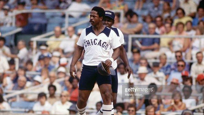
1. CHICAGO WHITE SOX 1976
These are so bad that I kind of love it. It's a total, "We don't care whatsoever about our players being comfortable." From the stiff-ass collar to those shorts that remind me of my parents dressing me up as a child for family portraits. THE most uncomfortable, stiffest shorts ever. God I hated wearing them.
Fun story - the White Sox actually brought back the uniforms as a throwback in 2016. White Sox pitcher Chris Sale was so mad - that he started cutting the uniforms up with scissors before the game, prompting him to be SUSPENDED FOR 5 GAMES and also fined by MLB.
WHO DO YOU THINK HAS THE UGLIEST JERSEY?
So there you have it. There are a ton of honorable mentions - from the New York Islanders "Fishsticks" jerseys, to the fluorescent lime green that the Seattle Seahawks have been wearing, to the powder blue/mirror New Jersey Nets ones and plenty of questionable college football jerseys as well.
As they say beauty, or ugliness, is in the eye of the beholder.
So chime in below on your Top 5!